最近有一个输入验证码的需求,就跟我们在app中常见的一样。
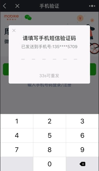
问题是怎么用H5实现?
首先很容易想到的是,放一个input,用letter-spacing控制字间距,下面放六根下横线,用过都知道控制间距并保证字符和横线对其是个很麻烦的事情,还很难兼容各种尺寸的终端。
本着不会就面向google编程的风格,我终于找到了一个解决方案:label + input
这个实现有以下三个妙用:
- label 元素的 for 属性可以绑定一个 input id,效果是点击 label 会触发input聚焦。
- input 隐藏了,怎么实现光标的闪烁效果?可以使用animation动画。
- v-for 可以接受整数,这样可以重复模版对应的次数,这样就不用构造数组了。
最后效果:

代码经过修改之后如下:
<template>
	<div class="code">
		<input ref="codeInput" id="vcode" type="tel" maxlength="6" v-model="code" @focus="isCodeInputFocused = true"
				@blur="isCodeInputFocused = false">

		<label for="vcode" v-for="(item,index) in codeLength" :key="index"
			:class="{'animated': isCodeInputFocused && cursorIndex === index}">
			{{codeArr[index]}}
		</label>
	</div>
</template>
<script>
export default {
	name: 'validate-code',
	data () {
		return {
			code: '',
			codeLength: 6,
			isCodeInputFocused: false
		}
	},
	mounted() {
		this.$refs.codeInput.focus()
	},
	computed: {
		codeArr() {
			return this.code.split('')
		},
		cursorIndex() {
			return this.code.length
		}
	},
	watch: {
		code(newValue) {
			this.code = newValue.replace(/[^\d]/g, '')
			if (this.code.length > 5) {
				this.$refs.codeInput.blur()
			}
		}
	}
}
</script>

<style lang="less" scoped>
	.code {
		margin-top: 20px;
		display: flex;
		justify-content: space-between;
		margin: auto 20px;

		input {
			position: absolute;
			top: -100%;
			left: -8888888;
			opacity: 0;
		}

		label {
			position: relative;
			width: 40px;
			height: 32px;
			line-height: 32px;
			text-align: center;
			font-size: 28px;

			&::before {
				position: absolute;
				content: '';
				left: 0;
				bottom: 0;
				width: 100%;
				height: 1px;
				background: #333333;
				transform: scaleY(.3);
			}
		}

		.animated {
			&::after {
				position: absolute;
				right: 50%;
				top: 20%;
				width: 1px;
				height: 60%;
				content: '';
				background-color: #333333;
				.animation(cursor 1s infinite both);
			}

			.keyframes(cursor; {
				0% {
					opacity: 0;
				}
				25% {
					opacity: 0;
				}
				50% {
					opacity: 1;
				}
				75% {
					opacity: 1;
				}
				to {
					opacity: 0;
				}
			})
		}
	}

	.keyframes(@name; @arguments) {
		@-moz-keyframes @name { @arguments(); }
		@-webkit-keyframes @name { @arguments(); }
		@keyframes @name { @arguments(); }
	}

	.animation(@arguments) {
		-webkit-animation: @arguments;
		-moz-animation: @arguments;
		animation: @arguments;
	}
</style>
1
2
3
4
5
6
7
8
9
10
11
12
13
14
15
16
17
18
19
20
21
22
23
24
25
26
27
28
29
30
31
32
33
34
35
36
37
38
39
40
41
42
43
44
45
46
47
48
49
50
51
52
53
54
55
56
57
58
59
60
61
62
63
64
65
66
67
68
69
70
71
72
73
74
75
76
77
78
79
80
81
82
83
84
85
86
87
88
89
90
91
92
93
94
95
96
97
98
99
100
101
102
103
104
105
106
107
108
109
110
111
112
113
114
115
116
117
118
119
120
121